
AI House Design Color Scheme: Whole-Home Palettes That Flow
Picking colors one room at a time is how homes end up feeling like a patchwork of unrelated decisions. The fix is a single whole-home palette, and an AI house design tool can generate and preview one across every room and the facade from a single photo. This guide covers the four palette roles, the 60-30-10 rule, how to make color flow from room to room, and how to coordinate the exterior — the whole house, not one wall at a time.
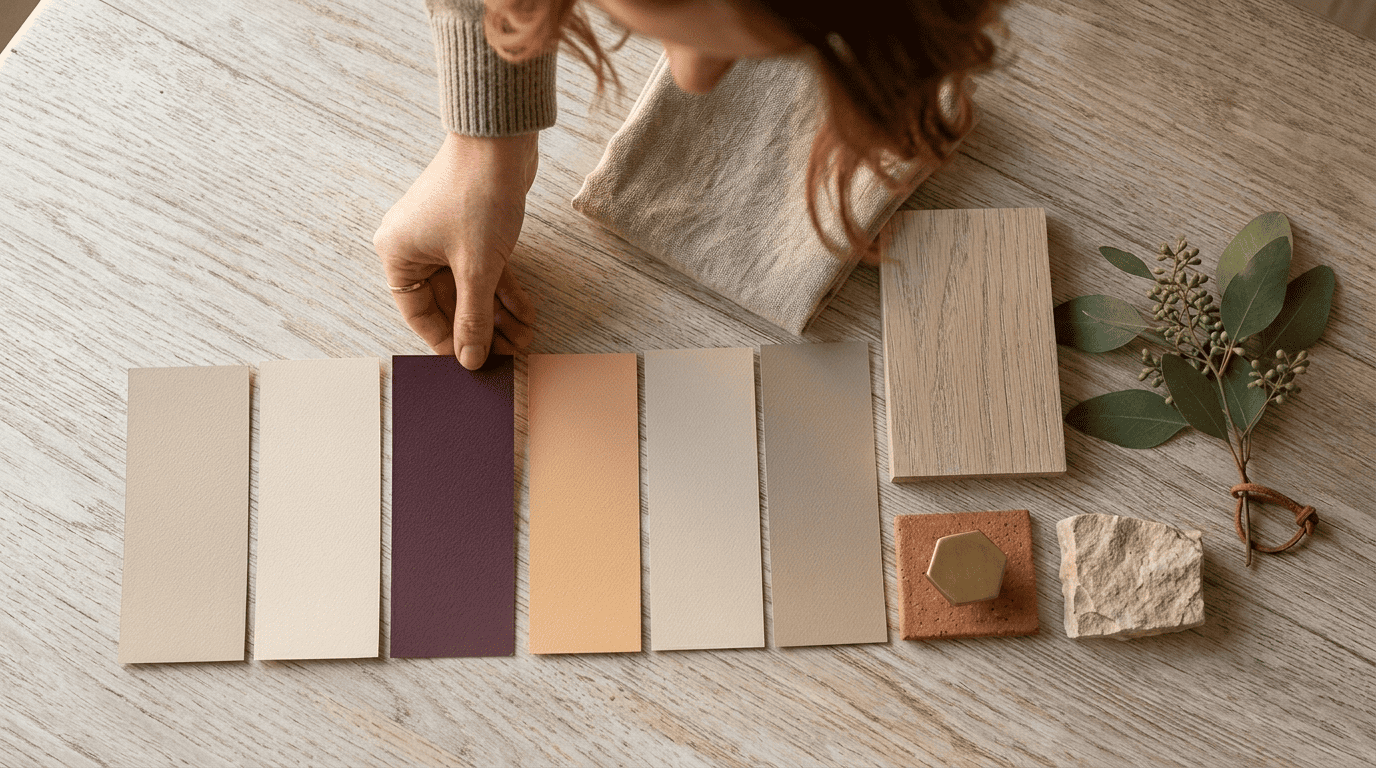
What a Whole-Home Color Palette Actually Is
A whole-home palette limits the entire house to a small, coordinated set of colors instead of letting each room pick its own direction. Most homes land at 5-7 total colors as the optimum, with 4-8 as the outer range; a house under 1,000 square feet usually works fine with 4-5. Benjamin Moore frames the ideal palette as 6-7 hues built around one anchor. Every color in the set plays one of four roles: dominant, secondary, trim, or accent.
One palette, four roles
Every color in a whole-home palette plays exactly one of four roles:
- Dominant — the largest surfaces: walls and major furniture.
- Secondary — supplemental spaces like a foyer or dining room, sharing the dominant’s undertone.
- Trim — one consistent off-white or neutral that runs through every doorway.
- Accent — the smallest, most saturated slice, reserved for details that create visual interest.
Why it beats picking room by room
One shared foundation is what creates flow, and it also works as a decorating shortcut — once the palette is set, most individual color choices become close to automatic instead of a fresh decision every time. A cohesive, limited palette is a common thread among the whole-house guides that top the category, and it is the single biggest difference between a house that reads as “designed” and one that reads as a series of disconnected rooms.
The 60-30-10 Rule in Every Room
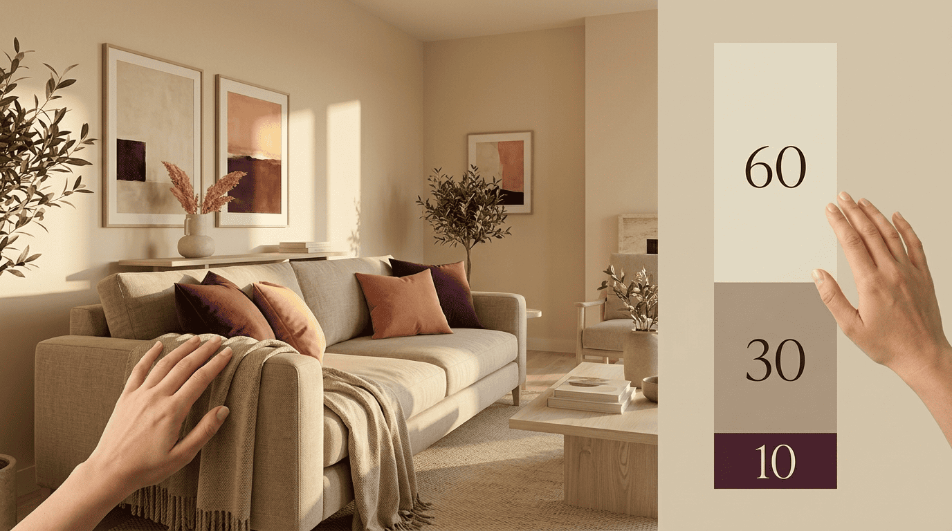
The 60-30-10 rule is the most common formula for splitting a room’s surfaces between the palette’s roles, and it repeats identically from room to room using the same whole-house palette. The concept borrows from basic color theory — the relationships between hues that Wikipedia’s color wheel entry documents as the foundation for building complementary, analogous, and monochromatic schemes.
| Share | Role | Typical surfaces |
|---|---|---|
| 60% | Dominant | Walls, large furniture, the visual backdrop |
| 30% | Secondary | Upholstery, curtains, painted furniture |
| 10% | Accent | Pillows, art, accessories — the focal pop |
60% / 30% / 10%, room by room
The dominant 60% is the backdrop viewers register first — the color that fills the largest continuous surfaces. The secondary 30% sits one layer in, on upholstery and window treatments. The accent 10% does the least square footage but the most visual work, drawing the eye to a single focal point. Applying that same ratio, room after room, is what keeps a house from feeling like it was decorated by six different people.
Bending the rule
The formula is not rigid. Some rooms work better split into 60-30-10-10 to make room for a fourth accent color. Others go fully monochromatic — one hue carried across many shades and finishes instead of four distinct colors. A 40-30-20-10 split shows up often in rooms with more architectural detail to balance. Treat 60-30-10 as a starting frame, not a law to follow exactly.
How to Make Color Flow Room to Room
Color flow is what separates a whole-house palette from a set of nicely painted individual rooms, and it depends on deliberate repetition rather than coincidence.
Repeat one color everywhere. The most reliable trick is what designers call a continuous thread — making sure one color from the palette shows up, in some form, in every single room. A living room’s dominant wall color might reappear as a kitchen accent; that single point of repetition is often enough to link two spaces that would otherwise feel unrelated.
A wall color in the dining room might reappear as a sofa welt in the living room, and then surface again in a powder room wallpaper where that same tone is woven in more softly.
Lisa Gilmore, on her “continuous thread theory”
Keep trim and sightlines consistent. One trim color, run through every doorway and hallway, does more to unify a house than almost any other single decision. Popular off-white trims include White Dove OC-17, Swiss Coffee OC-45, and Chantilly Lace OC-65. Beyond trim, check sightlines — the colors visible from one room into the next, through a doorway or open floor plan, need to complement each other rather than clash at the threshold.
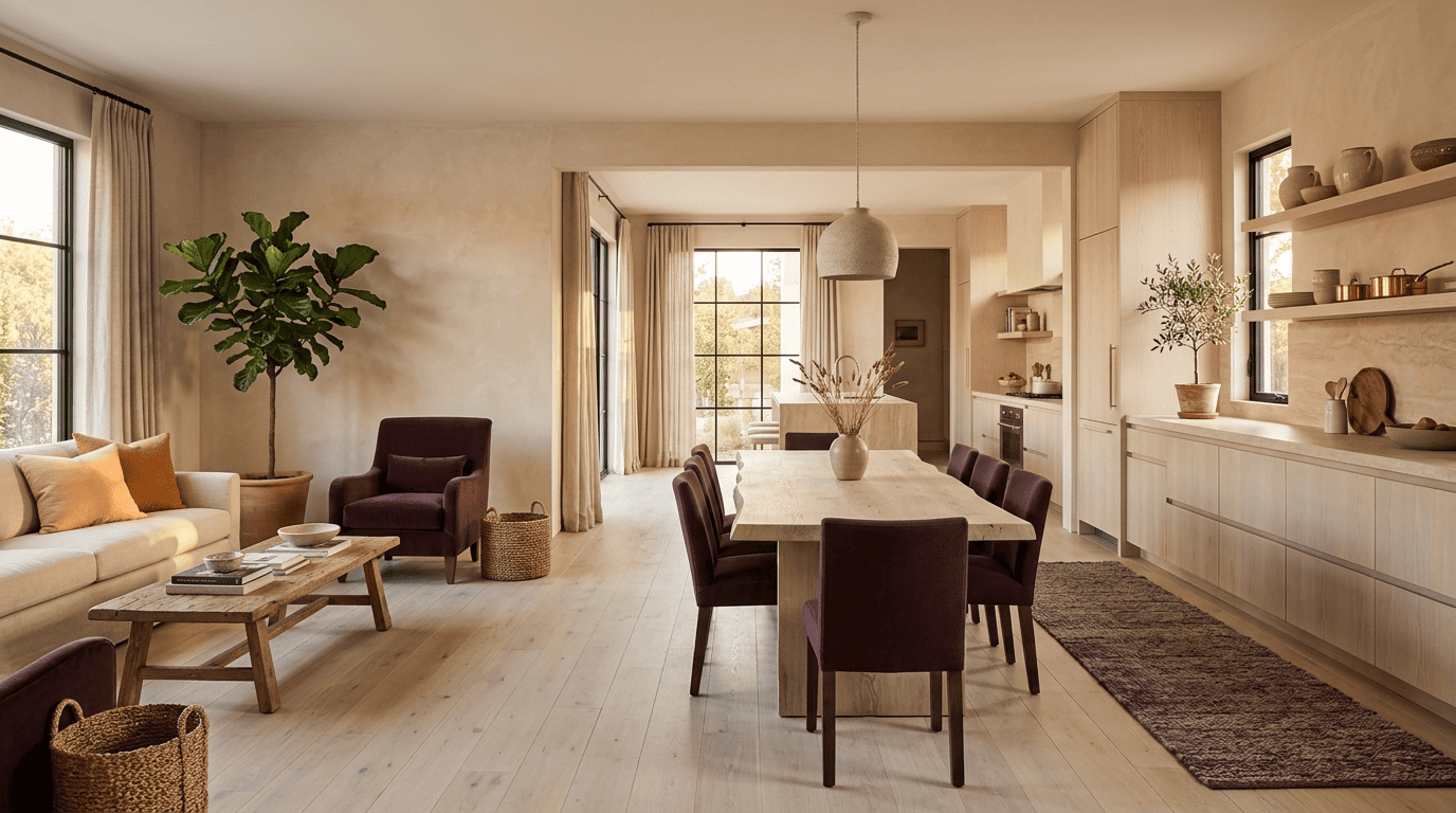
Hold undertones to one lane. Every color carries a warm or cool undertone underneath its surface hue, and mixing lanes across a sightline is the most common reason a palette that looked cohesive on paper feels off in the house. A cool gray next to a warm beige, viewed together from one room, reads as a mistake even when each color looks fine on its own.
Coordinating the Palette With Your Exterior
The facade is part of the palette
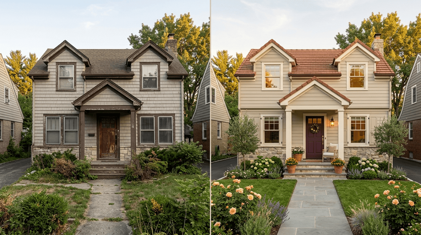
The exterior — siding, trim, shutters, front door, and garage — should share an undertone with the interior palette so that walking from the yard into the entryway feels like one continuous space rather than a hard cut. The front door is a natural place to echo an interior accent color, giving the transition a visual anchor. Elements to check for a shared undertone include:
- Siding or main exterior wall color
- Trim around windows and the roofline
- Shutters
- Front door and garage door
Why previewing pays off
An exterior repaint typically runs $3,000 to $8,000, and color regret is common enough that most homeowners who preview a facade digitally end up switching from their first pick — strong reasons to preview a full scheme before buying a single gallon of paint. Previewing the whole facade, not a single swatch on one wall, is what catches undertone mismatches before they become an expensive mistake.
How AI Builds and Previews Your Whole-Home Palette
From photo to palette
Upload a single photo, and computer-vision tools read the space and generate cohesive multi-room palettes — monochromatic, complementary, or analogous — along with suggested accent walls and trim. Rendering speeds vary by tool, with some generating a full palette in roughly 10 to 18 seconds. A typical AI-generated output includes:
- A full-house dominant, secondary, trim, and accent set
- Several alternate schemes to compare side by side
- Suggested accent-wall placement per room
- A rendered preview of the exterior facade
Manual visualizers with real paint codes
Once an AI tool has generated a direction, matching it to purchasable paint is its own step. Sherwin-Williams’ ColorSnap tool covers more than 1,500 colors and lets you paint per surface manually, while Behr’s Project Color tool adds an augmented-reality preview mode for a real-time look at a single wall. The practical workflow most homeowners land on: use an AI visualizer to generate and test the whole-home scheme first, then match the winning colors to real paint codes through a brand’s own tool before ordering samples.

| Tool | What it does |
|---|---|
| AI whole-home visualizer | Generates a cohesive multi-room and exterior palette from one photo |
| Sherwin-Williams ColorSnap | Manual, per-surface matching against 1,500+ real paint colors |
| Behr Project Color | AR preview of a single wall in real time |
Your Step-by-Step Whole-Home Palette
- Designate a central room and pick its dominant color.
- Add one to three secondary colors that share the same undertone.
- Choose a single trim color to run through every doorway.
- Pick one or two accent colors to repeat across rooms.
- Extend the palette to the facade, matching undertones.
- Preview the full scheme with an AI tool, then sample the finalists in real light.
Sample before you commit
Test swatches at roughly A4 size in each room, across different times of day — morning and evening light change how a color reads. Account for existing flooring, cabinets, and countertops, since those permanent elements are part of the palette whether they were chosen for it or not. Before locking in a final scheme, double-check a few practical details:
- Sample size is close to A4, not a tiny paint chip
- Each swatch was viewed in morning, midday, and evening light
- Existing flooring, cabinets, and countertops are accounted for
- Finish (matte, satin, or semi-gloss) is decided, since sheen changes how a color reads
If any part of the plan touches load-bearing walls or other structural changes, bring in a licensed architect or engineer before proceeding — color planning stops at the surface.